- Introduction
-
Specializations
Primary care
Specialization
Aesthetic dermatology
Allergology and immunology
Cardiology
Dentistry
Dermatology
ENT - Ear, Nose and Throat
Endocrinology and diabetology
Gynecology
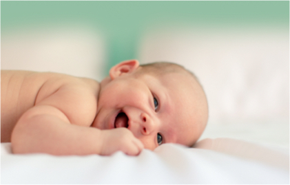
Gynecology for children
Nephrology for children
Neurology
Nutritional therapy
Occupational therapy
Ophthalmology
Orthopaedics
Paediatric Gastroenterology Prague
Paediatric urology
Proctology
Psychiatry
Psychiatry for Children and Adolescents
-
Doctors and Therapists
Tereza Agnew, M.A., DiS.
MUDr. Kristina Baroian
MUDr. Pavla Bednářová
MUDr. Karel Bulíř
Helena Reina Calzado
MUDr. Pavel Cinegr
Mgr. Helena Červená
MUDr. Jitka Činátlová
Mgr. Karolina Diallo, Ph.D.
MUDr. Zdenka Dolná
MUDr. Marcel Drlík, FEAPU
doc. MUDr. Barbora East, PhD, FEBS AWS
MUDr. Robert Frei
doc. MUDr. Jiří Hanáček, Ph.D.
Mgr. Barbora Hejlíková
MUDr. Zuzana Hendrickson
MUDr. Simona Herczová
MUDr. Pavel Hladík
MUDr. Petra Hlaváčová
Ing. Šárka Hodslavská, Dis.
MUDr. Alena Holá
MUDr. Martin Hromada
Mgr. Marie Hýblová
MUDr. Patricie Jagr
MUDr. Hana Jandíková, Ph.D.
MUDr. Petr Janský
Mgr. Eliška Kleisnerová
odb. as. MUDr. Aneta Klímová, Ph.D.
doc. MUDr. Adam Klocperk, Ph.D.
Mgr. Renata Jardin Kocourek, DiS.
MUDr. Barbora Kolářová
MUDr. Kateřina Krejčí
MUDr. Dagmar Krbcová, Ph.D.
MUDr. Ing. Iva Krulová
Bc. Anna Kumbárová
MUDr. Bohdana Lacmanová
MUDr. Zbyněk Langr, MBA
Bc. Jana Levans, DiS.
MUDr. Nikola Lochmanová
Mgr. Zdeněk Louda
MUDr. Alice Madurová
MUDr. Radka Maritato
MUDr. Petr Mašát, Ph.D.
MUDr. Markéta Matějková, FEBU
MUDr. Ivo Michalička
MUDr. Lucie Milatová
odb. as. Ing. Martin Meliška
MUDr. Lenka Mrázková
MUDr. Monika Müllerová
Bc. Oliver Najman, MN. Nutr
MUDr. Markéta Nejdl, MSc, DIC
MUDr. Veronika Netušilová
MUDr. Natália Newland
MUDr. Jitka Obluková
Mgr. Pavel Oulovský
MUDr. Nikola Pastorková
MUDr. Markéta Pernikářová
MUDr. Marek Plánička
MUDr. Jana Pokorná
MUDr. Lucie Polák
MUDr. Stanislava Polášková
Dr. Amanda Preston, Ph.D.
MUDr. Jan Přáda
MUDr. Jitka Radvanská
MUDr. Miroslav Roš
Marie Rumlerová, MSc.
MUDr. Viktor Řeháček
MUDr. Magdaléna Sazamová
MUDr. Marcela Schejbalová
MUDr. Jiří Skořepa
MUDr. Helena Součková
MUDr. Kateřina Storey, Ph.D.
Ingrid Svačinková
prof. MUDr. Petra Svozílková, Ph.D.
MUDr. Adam Šepeľa
Mgr. Kateřina Šimečková
MUDr. Marek Šlais
MUDr. Jakub Štádler
MUDr. Kristina Štěpánková Tůmová
MUDr. Šárka Štolbová, Ph.D.
Carmen Gloria Vrubel-Fernández Verdejo, MSc.
MUDr. Eva Valentová
MUDr. Jana Valešová
PhDr. Hana Vránová, Ph.D.
MUDr. Radim Vyhnánek
Mgr. Marie Zachová
MUDr. Martina Zlínská
as. MUDr. Renata Ženíšková
- Day Surgery
- For Clients
- About us
- U.S. VISA Medical Exam
- Contact
- Conference
- EN